looks like the strong $ policy is working......
thank to tim for the image of the economist (from 2004) could be on the next cover too......
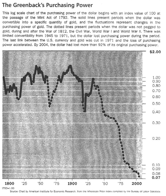
make sure you read the story
http://themessthatgreenspanmade.blogspot.com/2006/11/disappearing-dollar.html

story to this chart from jeff saut http://www.raymondjames.com/inv_strat.htm

größer/bigger http://www.raymondjames.com/images/inv_strat/inv_strat_061127_1lrg.gif
please note that this chart shows only the inflation adjusted purchasing power and has nothing direct to to with other currencies.thank god the fed is tough on inflation......../bitte bedenken das dieser chart die inflationsbereinigte kaufkraft des $ zeigt und nichts direkt mit anderen währungen zu tun hat. gottseidank ist die fed ja ein harter inflationsbekämpfer
make sure you read the story
http://themessthatgreenspanmade.blogspot.com/2006/11/disappearing-dollar.html
story to this chart from jeff saut http://www.raymondjames.com/inv_strat.htm
größer/bigger http://www.raymondjames.com/images/inv_strat/inv_strat_061127_1lrg.gif
please note that this chart shows only the inflation adjusted purchasing power and has nothing direct to to with other currencies.thank god the fed is tough on inflation......../bitte bedenken das dieser chart die inflationsbereinigte kaufkraft des $ zeigt und nichts direkt mit anderen währungen zu tun hat. gottseidank ist die fed ja ein harter inflationsbekämpfer
looks like the strong $ policy isn´t working for the us (domestic+overseas)......
sieht so aus als wenn die "politik des starken $" wirkung zeigt (sowohl in der heimat als auch im ausland).........
disclosure: short $, long gold, goldbugs
Labels: us$ index
posted by jmf at 12:34 AM
![]()
![]()
![[Most Recent Quotes from www.kitco.com]](http://www.kitconet.com/charts/metals/gold/t24_au_en_usoz_2.gif)
![[Most Recent Quotes from www.kitco.com]](http://www.kitconet.com/charts/metals/gold/t24_au_en_euoz_2.gif)


2 Comments:
Yep.
The chart showing the loss of US dollar purchasing power was not what I expected. Previously, I've come across statements indicating prices were pretty consistent throughout the 1800s (Greenspan) and that the decline of the dollar stems from the creation of the Fed in 1913 (the Austrians). This chart shows that there were considerable moves in the purchasing power of the dollar prior to 1913 and the consistent downward spiral occured sometime around WWII. I would have thought the US victory in WWII would have generated a strong dollar. Or maybe because this chart is related to purchasing power and not foreign currencies, it is an incomplete picture of what's happening to the greenback. ?
Post a Comment
<< Home