historische betrachtung
dank auch an mish und sein markettraderforumhttp://www.markettradersforum.com/forum1/1515.html
ist bisher eine der besten zusammenfassungen des wahnsinns über einen langen zeitraum. genau dieser historische abgleich macht das ausmaß überdeutlich.
Why do I believe there is a housing bubble? Let’s look at some long-term statistics compiled by Dr. Shiller, professor of economics at Yale.

This graph shows housing prices in the US, normalized for inflation, since 1890. The number was set to 100 at the left end of the graph and has bobbled around between 60 and 120 for 110 straight years. Until the last five years,when it started its rapid move up to 180. Our homes (again, adjusted for inflation) are historically “off the chart” in terms of pricing.
People like to argue that “things are different this time.” Which is why Shiller’s graph shows long-term graphs of the various quantities that people say “are different this time” - which, looking at the graphs are not really correlated with this magnitude of housing price increases.
The building-cost index has moved up (note the axes - it also starts at 100 and ends at 160), and that explains some of the rise in prices. This index has been above its current level for the prior forty years. If that was the cause of the bump in prices it would have manifested itself a generation or two ago.
Are housing prices related to population growth? Well, the US population has been growing fairly constantly for the last 110 years, and we haven’t had a rash of births or immigration since 2000. This “cause” doesn’t look too likely, either.
And finally, people like to say the increase in housing prices is due to low interest rates. The bottom line shows the 10-year treasury yield for the past 110 years - it’s higher now than when this started. There have been lower rates, and higher rates, and until now you haven’t seen this big price increase.
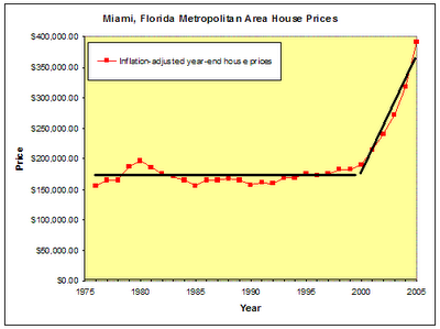
Since my next few posts are going to deal with Florida, let’s look at prices in Miami (taken from this site which compiles pricing statistics for many areas). I’ve taken their data and created separate trendlines for years 1975-2000 and 2000-2005. The first trendline has a slope of $258 - meaning, over
that 25 years, after inflation, your house could be expected to be worth $258 more every year. In the last 5 years, after inflation, your house was expected to be worth $44,000 more every year. Quite a change. Is something different this time? I highly doubt it.
What Shiller believes, and I believe, is that “things aren’t different this time” - that there isn’t a fundamental reason for this price increase. It’s all speculation, herd mentality, much like the Internet bubble or take your pick from a long list of bubbles through history. Take a look at the aftermath of bubbles, and they (more commonly) revert quickly to the mean (meaning prices would go down by 40% or more), or (less commonly) prices stay flat until inflation catches up with prices. The final two graphs are, first, the aftermath of the recent internet bubble and a graph that compares Japan’s real-estate crash (which reverted to the mean) over a much longer period of time. Note that our own real-estate prices have increased much higher than the Japanese bubble ever went. (ergänzend sollte man hier noch erwähnen das der finanle exzess in den usa im jahr 2005 in der grafik nicht vermerkt ist. würde sonst noch grausiger aussehen)
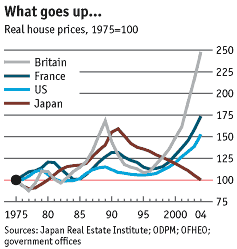
grafik vom "the economist"
alle rationellen erklärungsversuche für den hype in den letzten 5 jahren laufen ins leere. zum schluß hilft nur noch "this time it´s different "als verzweifelter erklätungsversuch. hat den dot.coms auch nicht geholfen.
gruß
jan-martin
posted by jmf at 3:01 AM
![]()
![]()
![[Most Recent Quotes from www.kitco.com]](http://www.kitconet.com/charts/metals/gold/t24_au_en_usoz_2.gif)
![[Most Recent Quotes from www.kitco.com]](http://www.kitconet.com/charts/metals/gold/t24_au_en_euoz_2.gif)


0 Comments:
Post a Comment
<< Home