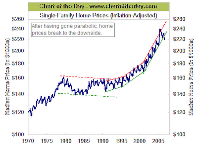
singe family homes prices (infaltion adjusted) / chart
this chart shows clear signs of breaking down....../ der chart sieht für mich wenig verheißungsvoll aus.....

dank geht an http://www.chartoftheday.com/
Recent press reports suggest that the US real estate market is slowing. For some perspective, today's chart illustrates the US median price of a single-family home over the past 36 years. Thanks, in part, to low long-term interest rates, the trend over the past decade has been impressive. Not only did housing prices increase at a rapid rate, the rate at which housing prices increased - increased. That brings us to today's chart which illustrates how housing prices have just dropped below their accelerated upward trend. Stay tuned...
posted by jmf at 1:17 AM
![]()
![]()
![[Most Recent Quotes from www.kitco.com]](http://www.kitconet.com/charts/metals/gold/t24_au_en_usoz_2.gif)
![[Most Recent Quotes from www.kitco.com]](http://www.kitconet.com/charts/metals/gold/t24_au_en_euoz_2.gif)


2 Comments:
No sign of that happening yet in the UK of course. Over the last couple of evenings I've tried to compile a chart comparing relative inflation, money supply, housing and other asset stypes. Here.
hi jock,
the uk really surprises me. the longer the runup the deeper the slump will be.
Post a Comment
<< Home